Matplotlib Basics 📈🎨✏️
Master the tools. Then let the data speak. Matplotlib is an artist's sketchbook — same tools, endless combinations!
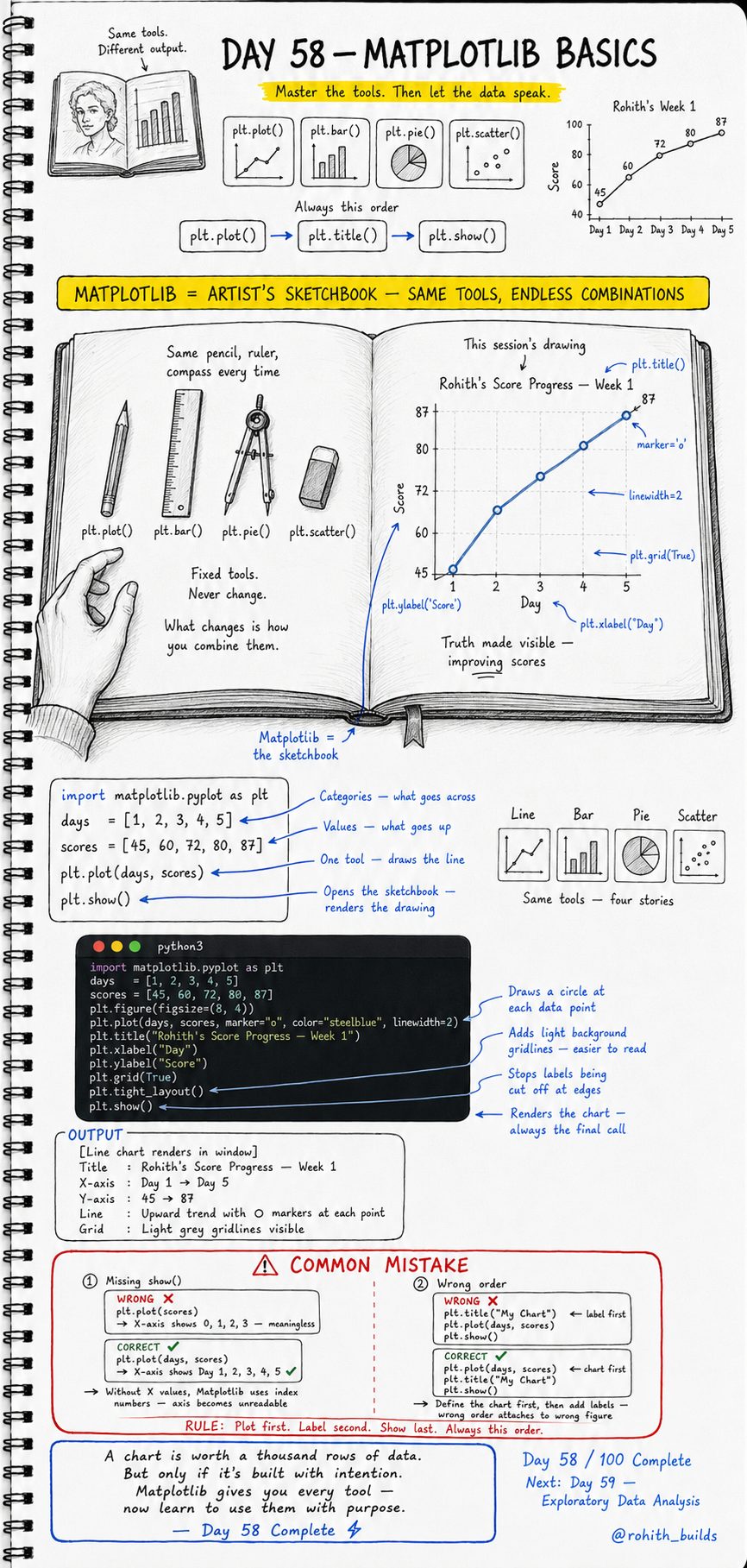
Day 58: Matplotlib Basics — Same Tools, Endless Stories!
Why Should I Care?
An artist always uses the same pencil, ruler and compass. What changes is how they combine them. Matplotlib works exactly like that. Four fixed tools — plt.plot(), plt.bar(), plt.pie(), plt.scatter(). Master these and you can tell any story with any data. A chart built with intention is worth a thousand rows of numbers!
The Golden Rule — Always This Order
Plot first. Label second. Show last. Every single time. Define the chart, then add titles and labels, then render with show(). Wrong order means labels attach to the wrong figure or X-axis becomes meaningless index numbers. Respect the order and your charts always work!
Your First Line Chart
import matplotlib.pyplot as plt

days   = [1, 2, 3, 4, 5]
scores = [45, 60, 72, 80, 87]

plt.plot(days, scores)
plt.show()
days goes on the X-axis. scores goes on the Y-axis. plt.plot() draws the line. plt.show() opens the sketchbook and renders the drawing. Without days as the X value, Matplotlib uses 0, 1, 2, 3 as index numbers — making the axis meaningless!
A Professional Line Chart
import matplotlib.pyplot as plt

days   = [1, 2, 3, 4, 5]
scores = [45, 60, 72, 80, 87]

plt.figure(figsize=(8, 4))
plt.plot(days, scores, marker="o", color="steelblue", linewidth=2)
plt.title("Rohith''s Score Progress — Week 1")
plt.xlabel("Day")
plt.ylabel("Score")
plt.grid(True)
plt.tight_layout()
plt.show()
marker="o" draws a circle at each data point — makes individual values visible. color="steelblue" styles the line. linewidth=2 makes it bolder. plt.grid(True) adds light grey gridlines — easier to read. tight_layout() stops labels from being cut off. Now this chart tells a story — improving scores, day by day!
Four Tools — Four Stories
# Line  — trends over time
plt.plot(days, scores)

# Bar   — comparing categories
plt.bar(names, scores)

# Pie   — parts of a whole
plt.pie(values, labels=labels)

# Scatter — relationships between two values
plt.scatter(hours_studied, scores)
Same import. Same show(). Same label pattern. Only the chart function changes. This is why Matplotlib is called a sketchbook — fixed tools, what changes is the story you choose to tell!
Real World Connection
When Hotstar shows viewer count growing daily — plt.plot() line chart. When a cricket app compares team run rates — plt.bar() bar chart. When a news app shows election vote share by party — plt.pie() pie chart. When a fitness app checks if sleep hours affect performance — plt.scatter() scatter plot. Every chart in every app and dashboard was built with exactly these four functions!
Common Mistakes
Mistake 1 — Missing X values in plt.plot().
plt.plot(scores)          # WRONG — X shows 0,1,2,3 — meaningless!
plt.plot(days, scores)    # CORRECT — X shows Day 1,2,3,4,5!
Mistake 2 — Adding title before plotting.
plt.title("My Chart")     # WRONG — attaches to wrong or empty figure!
plt.plot(days, scores)
plt.show()

plt.plot(days, scores)    # CORRECT — plot first, label second!
plt.title("My Chart")
plt.show()
Mini Challenge
Mini Challenge
Create a line chart of your own study hours over 7 days. Add markers, a title, X and Y labels and a grid. Then create a second bar chart comparing scores of 5 friends. Label everything properly. Run both in one file using two separate plt.figure() calls. You just built the same progress tracking charts that every learning app like Duolingo and Khan Academy shows their students!
Quick Quiz
Q: What is the correct order for building a Matplotlib chart? A: Plot first, label second, show last — always this order, never deviate!
Q: What does marker="o" do in plt.plot()? A: Draws a circle at every data point — makes individual values visible on the line!
Q: What happens if you call plt.plot(scores) without passing days first? A: X-axis shows 0, 1, 2, 3 index numbers — meaningless and unreadable!
Key Takeaways
Key Takeaways
- Matplotlib has four core tools — plot, bar, pie, scatter. Same tools, different stories.
- Always follow the order — plot first, label second, show last.
- Always pass X values explicitly — without them the axis becomes meaningless index numbers.
- marker, color, linewidth and grid make charts readable and professional.
- A chart built with intention is worth a thousand rows of data!
Continue Learning with Rohi
You've used your 3 free Rohi questions. Create a free account to continue learning.