Data Visualization 📊🎨🗺️
See the pattern. Tell the story. Change the decision. Charts make the invisible impossible to ignore!
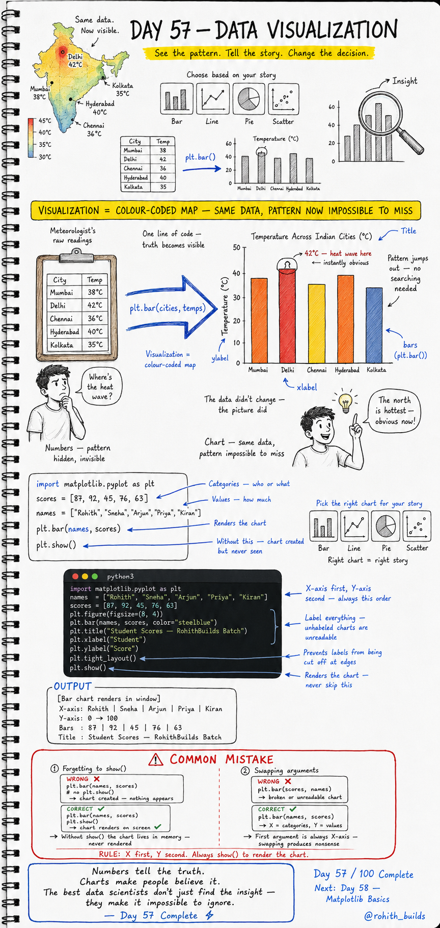
Day 57: Data Visualization — Make Patterns Impossible to Miss!
Why Should I Care?
Look at a table of city temperatures — Mumbai 38, Delhi 42, Chennai 36, Hyderabad 40, Kolkata 35. Can you immediately spot the heat wave? Probably not. Now show that same data as a coloured bar chart and Delhi's 42 degree bar jumps out instantly. The data did not change. The picture did. That is what visualization does — it makes truth impossible to miss!
Your First Chart
import matplotlib.pyplot as plt

names  = ["Rohith", "Sneha", "Arjun", "Priya", "Kiran"]
scores = [87, 92, 45, 76, 63]

plt.bar(names, scores)
plt.show()
plt.bar() creates the chart. plt.show() renders it on screen. Without show() the chart is created in memory but never displayed — it simply disappears. Two lines turned a list of numbers into a visual story!
A Professional Chart
import matplotlib.pyplot as plt

names  = ["Rohith", "Sneha", "Arjun", "Priya", "Kiran"]
scores = [87, 92, 45, 76, 63]

plt.figure(figsize=(8, 4))
plt.bar(names, scores, color="steelblue")
plt.title("Student Scores — RohithBuilds Batch")
plt.xlabel("Student")
plt.ylabel("Score")
plt.tight_layout()
plt.show()
figsize sets the canvas size. color makes bars steelblue. title names the chart. xlabel and ylabel label the axes — unlabelled charts are unreadable. tight_layout stops labels from being cut off at edges. This is how every professional chart is built!
Pick the Right Chart for Your Story
Bar chart — comparing categories. Who scored highest? Which city is hottest? Use when X is categories and Y is values. Line chart — showing trends over time. How did sales grow month by month? Use when data has a sequence. Pie chart — showing proportions. What percentage of users are premium? Use for parts of a whole. Scatter plot — showing relationships. Does studying more lead to higher scores? Use to find correlations. Right chart equals right story!
Real World Connection
When IPL shows win percentage by team — bar chart. When Zomato shows order volume growing month by month — line chart. When a news channel shows election vote share — pie chart. When a scientist checks if temperature affects cricket scores — scatter plot. Every dashboard you have ever seen on any news channel, sports app or business report is just matplotlib charts built by code exactly like this!
Common Mistakes
Mistake 1 — Forgetting plt.show().
plt.bar(names, scores)
# WRONG — chart created but nothing appears!

plt.bar(names, scores)
plt.show()
# CORRECT — chart renders on screen!
Mistake 2 — Swapping X and Y arguments.
plt.bar(scores, names)   # WRONG — broken unreadable chart!
plt.bar(names, scores)   # CORRECT — X is categories, Y is values. Always!
Mini Challenge
Mini Challenge
Create a bar chart of the top 5 IPL teams and their wins this season. Add a title, xlabel and ylabel. Use a colour other than steelblue. Then create a second chart — a line chart of your own monthly screen time over 6 months using plt.plot() instead of plt.bar(). You just built the same charts that every sports analytics dashboard and personal health app shows its users!
Quick Quiz
Q: What does plt.show() do and why can you never skip it? A: It renders the chart on screen. Without it the chart is created in memory but never displayed!
Q: Which argument comes first in plt.bar() — categories or values? A: Categories always first, values second — plt.bar(names, scores)!
Q: Which chart type would you use to show how app downloads grew month by month? A: Line chart — it shows trends and changes over time!
Key Takeaways
Key Takeaways
- Visualization turns numbers into patterns that are impossible to miss.
- plt.bar(X, Y) creates a bar chart. plt.show() renders it — never skip show()!
- Always add title, xlabel and ylabel — unlabelled charts are unreadable.
- X is always categories, Y is always values — swapping them breaks the chart.
- Numbers tell the truth. Charts make people believe it!
Continue Learning with Rohi
You've used your 3 free Rohi questions. Create a free account to continue learning.