Data Dashboard — Phase 3 Complete! 🏆📊🚀
60 days. Three complete phases. Build a full analyst dashboard that cleans data, finds patterns and draws charts automatically!
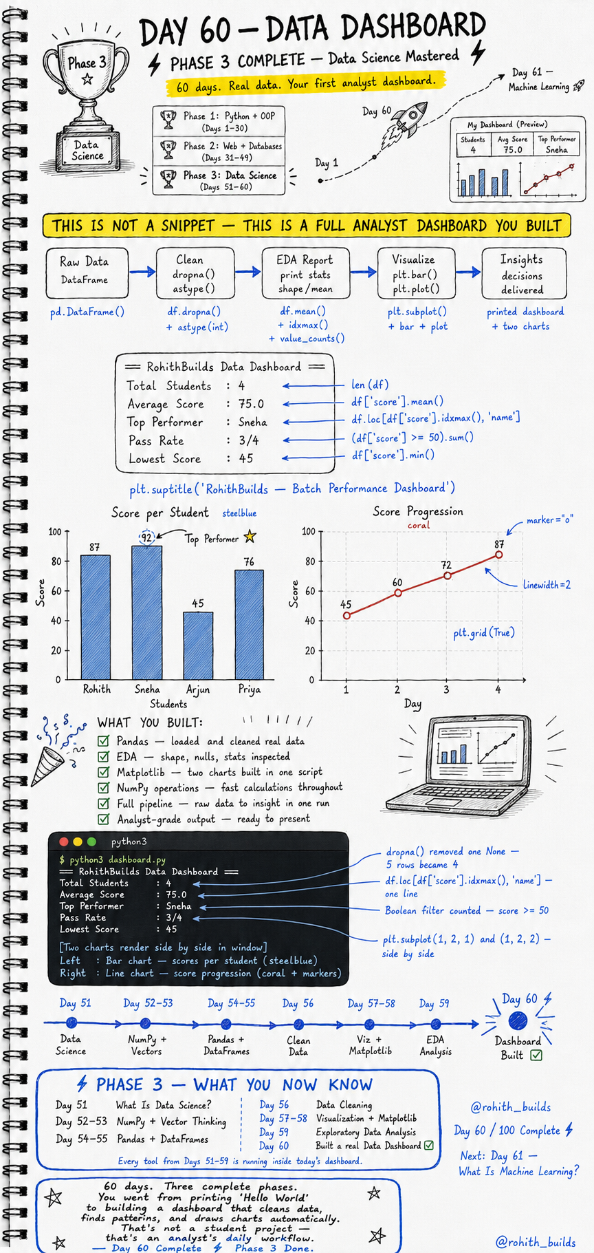
Day 60: Data Dashboard — Your First Analyst Dashboard!
Phase 3 Complete — What You Now Know
Day 51 — What Is Data Science. Days 52 to 53 — NumPy and Vector Thinking. Days 54 to 55 — Pandas and DataFrames. Day 56 — Data Cleaning. Days 57 to 58 — Visualization and Matplotlib. Day 59 — Exploratory Data Analysis. Today every single tool runs together in one professional analyst dashboard. You went from printing Hello World to building a dashboard that cleans data, finds patterns and draws charts automatically. That is not a student project — that is an analyst''s daily workflow!
The Full Pipeline
Raw DataFrame goes through dropna() and astype() to become clean data. Clean data goes through EDA — shape, mean, top performer, pass rate. EDA results go into Matplotlib to become two charts side by side. Charts plus printed stats equal a complete analyst dashboard ready to present. Raw data to insight in one single run!
The Complete Dashboard Code
import pandas as pd
import matplotlib.pyplot as plt

data = {
    "name"  : ["Rohith", "Sneha", "Arjun", "Priya", None],
    "score" : [87, 92, 45, 76, None],
    "day"   : [1, 2, 3, 4, 5]
}

df = pd.DataFrame(data)
df = df.dropna()
df["score"] = df["score"].astype(int)

print("== RohithBuilds Data Dashboard ==")
print(f"Total Students : {len(df)}")
print(f"Average Score  : {df['score'].mean()}")
print(f"Top Performer  : {df.loc[df['score'].idxmax(), 'name']}")
print(f"Pass Rate      : {(df['score'] >= 50).sum()}/{len(df)}")
print(f"Lowest Score   : {df['score'].min()}")
dropna() removes the row with None — 5 rows become 4. astype(int) makes scores proper integers. len(df) counts students. mean() calculates average. idxmax() finds the index of the highest score, then df.loc gets the name at that index. Boolean filter (score >= 50).sum() counts passing students. All in clean one-liners!
Adding the Two Charts
fig, (ax1, ax2) = plt.subplots(1, 2, figsize=(12, 5))

ax1.bar(df["name"], df["score"], color="steelblue")
ax1.set_title("Score per Student")
ax1.set_xlabel("Students")
ax1.set_ylabel("Score")

ax2.plot(df["day"], df["score"], color="coral", marker="o", linewidth=2)
ax2.set_title("Score Progression")
ax2.set_xlabel("Day")
ax2.set_ylabel("Score")
ax2.grid(True)

plt.suptitle("RohithBuilds — Batch Performance Dashboard")
plt.tight_layout()
plt.show()
plt.subplots(1, 2) creates two charts side by side in one figure. ax1 is the bar chart on the left — scores per student. ax2 is the line chart on the right — score progression over days. suptitle adds one master title across both. tight_layout prevents overlap. Two charts, one dashboard, one run!
What You Built
Pandas — loaded and cleaned real data. EDA — shape, nulls and stats all inspected. Matplotlib — two professional charts built in one script. NumPy operations — fast calculations used throughout. Full pipeline — raw data to insight in one run. Analyst-grade output — ready to present to any team. This is exactly what a junior data analyst submits on their first day at a company!
Real World Connection
When a school principal wants to know class performance — this dashboard. When an IPL team coach reviews player scores — this dashboard. When a startup founder checks weekly active users — this dashboard. When a hospital monitors patient recovery rates — this dashboard. Every analytics team in every company runs this exact pipeline. Load, clean, EDA, visualize, insight. You now speak the language of data professionals!
Mini Challenge
Mini Challenge
Build your own dashboard for a cricket team. Create a DataFrame with 6 players, their runs and match number. Clean the data. Print a stats summary — total players, average runs, top scorer, lowest scorer. Build two charts side by side — bar chart of runs per player and line chart of run progression across matches. Add a master title. You just built the analytics dashboard every cricket coaching team uses to evaluate their squad!
Quick Quiz
Q: How do you find the name of the student with the highest score? A: df.loc[df[''score''].idxmax(), ''name''] — idxmax finds the index, loc gets the name!
Q: What does plt.subplots(1, 2) create? A: One figure with two charts side by side — 1 row, 2 columns of charts!
Q: What is the correct full pipeline order? A: Load, clean, EDA, visualize, insight — every time, no shortcuts!
Key Takeaways
Key Takeaways
- A real dashboard combines cleaning, EDA, stats and visualization in one pipeline.
- idxmax() finds the index of the maximum value — use with df.loc to get the label.
- plt.subplots(1, 2) creates two charts side by side in one professional figure.
- suptitle() adds a master title above all subplots in the figure.
- You built a full analyst dashboard — that is not a student project, that is real work!
Continue Learning with Rohi
You've used your 3 free Rohi questions. Create a free account to continue learning.